

Why Amazon Premium A+ Content Feels Repetitive When Every Banner Says the Same Thing

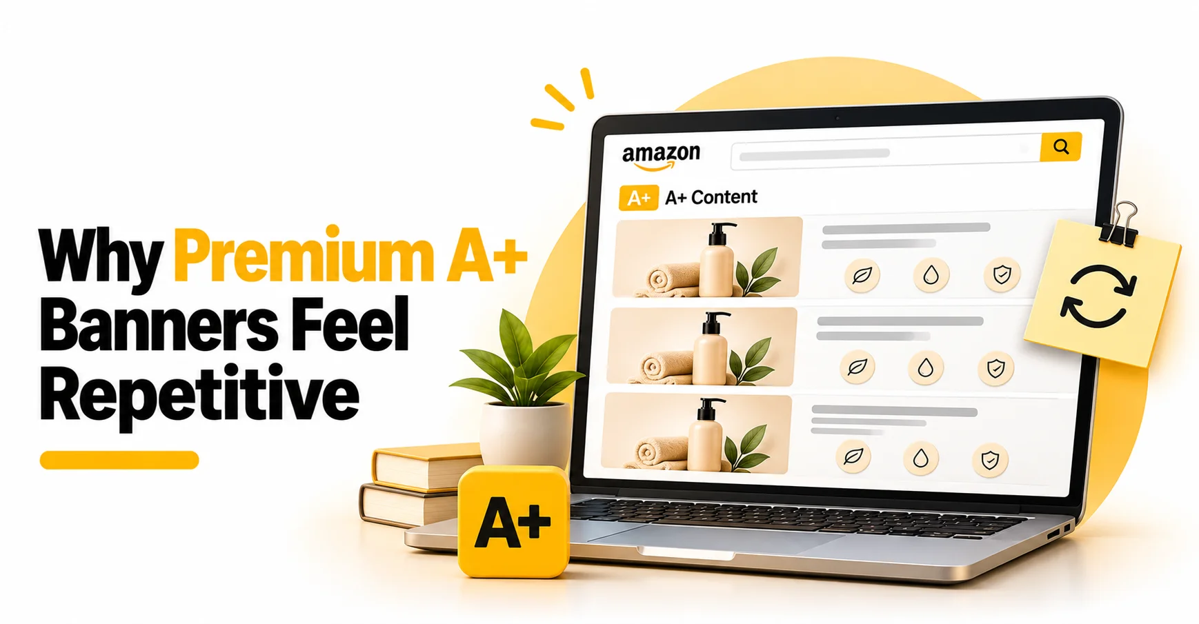
Premium A+ gives brands more visual space, but more banners do not automatically create a stronger product story. A page can look polished and still feel repetitive when every module repeats the same feature list, product angle, or slogan.
The problem is not repetition by itself. The problem is repetition without progression: the shopper scrolls, but learns nothing new.
For an Amazon agency India working on premium ecommerce content, the goal should be to make every module contribute something meaningful to the customer’s decision.
The Direct Answer
Give every A+ banner one clear job. Keep the product identity consistent, then move the shopper from recognition to detail, proof, fit, use, and offer clarity. Repeat only information that prevents misunderstanding such as size, compatibility, safety, or exact bundle contents and change the visual or copy role each time it appears.
Amazon’s official A+ Content design guide recommends balancing text and photos, including technical specifications, telling the brand story, and using modules such as comparison charts, carousels, hotspots, video, or Q&A according to the content type. The module should serve the buyer’s next question, not merely provide another place for the same headline.
Amazon’s A+ content guidelines also say A+ images and text should be unique to A+ and advise against reusing the same images already published in the image gallery. They prohibit small text that is unreadable on mobile and require useful image alt text. A repetitive design can therefore be both strategically weak and unnecessarily close to content the shopper has already seen.
When the Answer Changes
- Fit, compatibility, or safety is critical: Repeat the essential fact when the buyer could make the wrong purchase without it, but present it in a new context.
- The product requires assembly or a sequence: Use more than one module to explain steps, while keeping each module responsible for a different stage.
- The product is visually simple or premium: A repeated visual motif can create consistency, but the message should still progress from identity to detail to use.
- The catalogue needs comparison: Repeat only the attributes required to compare products accurately across a chart.
- The content is a Brand Story: Focus on the brand’s values, origin, or product family instead of copying the product-level A+ feature stack.
- The content must work on mobile: Reduce text density, check crop behavior, and make sure each module remains understandable without relying on tiny labels.
Practical Diagnostic Checklist
- Write the product’s verified facts before planning any banner.
- List the buyer questions the main image gallery and bullets do not answer.
- Assign one primary question to each A+ module.
- Mark every headline or feature that appears more than once.
- Keep repeated claims only when they prevent a meaningful buying error.
- Confirm that every product replacement uses the correct design, finish, scale, and orientation.
- Verify exact pack contents and packaging components before approving the final banner.
- Remove text, icons, or decorative elements copied from reference images unless they belong in the finished design.
- Check every performance, material, safety, and durability claim against supplied evidence.
- Write descriptive image alt text that explains the image rather than stuffing keywords.
- Use A+ Content Manager’s desktop and mobile preview before submission.
- Read the full page from top to bottom and ask whether each scroll reveals something new.
Anonymized Creative Example — No Screenshot Included
In a supplied Amazon US Premium A+ project for a men’s tungsten carbide ring, the verified design included a black brushed center, polished gold stepped edges, size 9.5, comfort fit, hypoallergenic and cobalt-free construction, and no gemstone. The project used a nine-banner plan rather than repeating one product summary nine times.
The sequence assigned separate jobs to the hero, design-detail, material and performance, comfort and size, use-case, office, wedding, hypoallergenic, and packaging banners. Creative review also corrected component placement and removed duplicate packaging elements from a presentation that included a silicone band, leather pouch, and walnut box. No sales, traffic, ranking, or conversion result was supplied or is claimed. No screenshot is shown because the supplied creative assets were identifiable.
Decision Table
| Banner job | Include | Avoid |
|---|---|---|
| Hero | Product identity and one core promise | Full feature list |
| Design detail | Finish, construction, and close-up evidence | Generic lifestyle copy |
| Material or performance | Verified material and supported claims | Unverified superlatives |
| Fit or compatibility | Size, comfort, measurements, or instructions | Decorative messaging |
| Lifestyle | One use context and realistic product placement | Repeated technical copy |
| Packaging or comparison | Exact contents or clear decision differences | Duplicate or extra items |
Mistakes Genuinely Observed by I.E.RARE
The following patterns are limited to issues documented in supplied listing and creative work:
- Repeating the same feature stack across hero, detail, and lifestyle banners without giving each module a different purpose.
- Replacing a product inside lifestyle hands or scenes without preserving the exact finish, scale, orientation, or design.
- Leaving text or icons from a reference image in the working creative after the useful visual direction had been extracted.
- Showing packaging components more than once or placing them in positions that changed the apparent offer.
- Mixing verified product details with a flagged claim instead of pausing for validation or removing the unsupported statement.
- Developing lifestyle concepts before locking the product design, included components, and packaging facts.
Recommended Action
- Start with a message map, not a banner count.
- Write one buyer question beside each planned module.
- Use the hero to establish identity and one value proposition.
- Use detail modules for materials, construction, dimensions, fit, or compatibility.
- Use lifestyle modules to show context rather than repeat specifications.
- Use packaging or comparison modules to remove offer ambiguity.
- Create a repetition audit that flags duplicated headlines, benefits, images, and claims.
- Validate mobile readability, image uniqueness, alt text, and claim support before submission.
- Remove any module that does not add a new answer, proof point, context, or decision aid.
Frequently Asked Questions
Is it wrong to show the product in every A+ banner?
No. The same product can appear throughout the page when each image changes the angle, scale, context, or buyer question. The repetition becomes weak when the image and message perform the same job every time.
How many messages should one A+ banner communicate?
Usually one primary message, supported by a small number of relevant details. A banner that tries to cover design, material, fit, use cases, packaging, and brand story at once becomes difficult to scan.
Should A+ Content repeat the product’s bullet points?
It can reinforce an essential fact, but it should expand, visualize, compare, or prove it. Copying bullets into image text does not make the information more useful.
What belongs in Brand Story instead of product-level A+ Content?
Brand Story should explain the brand’s values, origin, positioning, or connected product range. Product-level A+ should answer questions about the specific item, its features, use, fit, and offer.
Why must the mobile preview be checked?
Text, crops, and visual hierarchy can behave differently on a smaller screen. Amazon’s A+ Content design guide directs sellers to preview both desktop and mobile versions before submission.
Can repetitive A+ Content still look professional?
Yes. Strong photography and clean design can hide a weak information structure. The final review should test what the shopper learns from each module, not only whether each banner looks attractive.
Related I.E.RARE Services
I.E.RARE’s Amazon A+ Content Services combines verified product information, copy planning, module selection, image direction, mobile review, and creative quality control so every section has a clear role.
For brands preparing to introduce new products, our Amazon New Product Launch Services can connect launch planning with product content, listing optimization, PPC, and A+ Content development.
IERARE also provides Content Marketing Service to help brands develop useful, structured content that supports broader search visibility and customer education.
For businesses looking beyond Amazon, our Shopify Services support ecommerce store design, development, optimization, and growth.
Contact Us to discuss your A+ Content requirements and create a product story where every module has a clear purpose.
Author Bio
The I.E.RARE Team works across Amazon account management, Sponsored Ads, listing optimization, A+ Content, Brand Story, Storefront design, ecommerce SEO, creative production, and conversion improvement. Its articles focus on practical decisions grounded in supplied account evidence and current platform guidance.